

Lets get started:
1. Draw a circle using the Oval Tool (remember to hold down SHIFT when drawing it) and you should come up with a very neat circle below:

2. Add a Radial Gradient to the circle. You should have something like this:

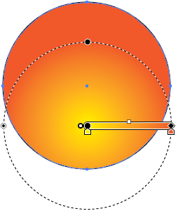
3. Now, adjust it by moving the center of gradiated area between the middle and the bottom of the circle. To do this, click the Gradient Tool in the tool bar and a white metre should appear accross the circle. Click and drag the black dot in the middle of the circle downwards. (make sure you click on another tool to avoid moving the gradient elsewhere. If that happens, just undo it by pressing CTRL-Z) It should look like this now:

4. This metre is used to change the effect of the gradient. We want to change the colours of the gradient. The arrows pointing at the dots are the current colours used in the gradient. (White and Black) Double-click both arrows and change the colours (White > Yellow. Black > Orange.)

Both the circle and the metre shold look like this now:

5. Now we need to expand the gradient. When your cursor is not hovering over the metre, there shold be a small square at the end. (where the Orange colour is) Drag it across to expand the gradient:


6. The yellow part of the gradient needs to be bigger. (or brighter) Go into the gradient options on the right-hand side of the screen and click in the yellow arrow, then click on Location and increase the percentage by 27.5%.

The Circle should now look like this:

7. Now we need to add a contrast. (shadow, thumbnail, whatever) select the Oval tool and draw another circle (oval) and drag it over the circle. (The oval needs to have a linear gradient) You should have this now:

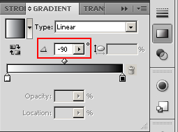
8: You need to have the white at the top and the black at the bottom. In the Gradient options, change the angle of the gradient by -90 degrees.
It should look like this now:

9. Next, we need to turn it into a proper highlight. Go into the Gradient options and change the black area into white, so now that both sides of the gradient are white. Now, on the same colour, change the opacity to 0. (make it transparant)(You may need to adjust the size of the highlight)

Now it should look like this:

10. Finally, we need to get rid of the black lines. Click on the selection tool (if you're not on it) and select both circles. Then click on "None" in the tool bar, (next to the Colour and Gradient options) and it now should look like this:

And there you have it! You are finished!
No comments:
Post a Comment